Pre Boarding + In Transit
Pre-boarding & In-transit Revamp
Background - 2019
Initially, this endeavor began as a straightforward initiative named "Top Up Via Driver" (TUVD 3.0). The primary objective was to support the Grab Financial Group by introducing a supplementary process within the current passenger pre-boarding and in-transit experience. This would enable passengers to replenish their Grab wallet, modify payment methods, and apply promos.
While I was deeply involved in the redesign of the pre-boarding and in-transit phases, it was challenging to put the redesign project on the roadmap. A design overhaul, when juxtaposed with the introduction of new services and features, doesn't always resonate with the same immediacy. But thanks to our team's persistence and a fortuitous presence in key meetings and email exchanges, this project emerged as the catalyst for decluttering the jam-packed passenger post-booking process.
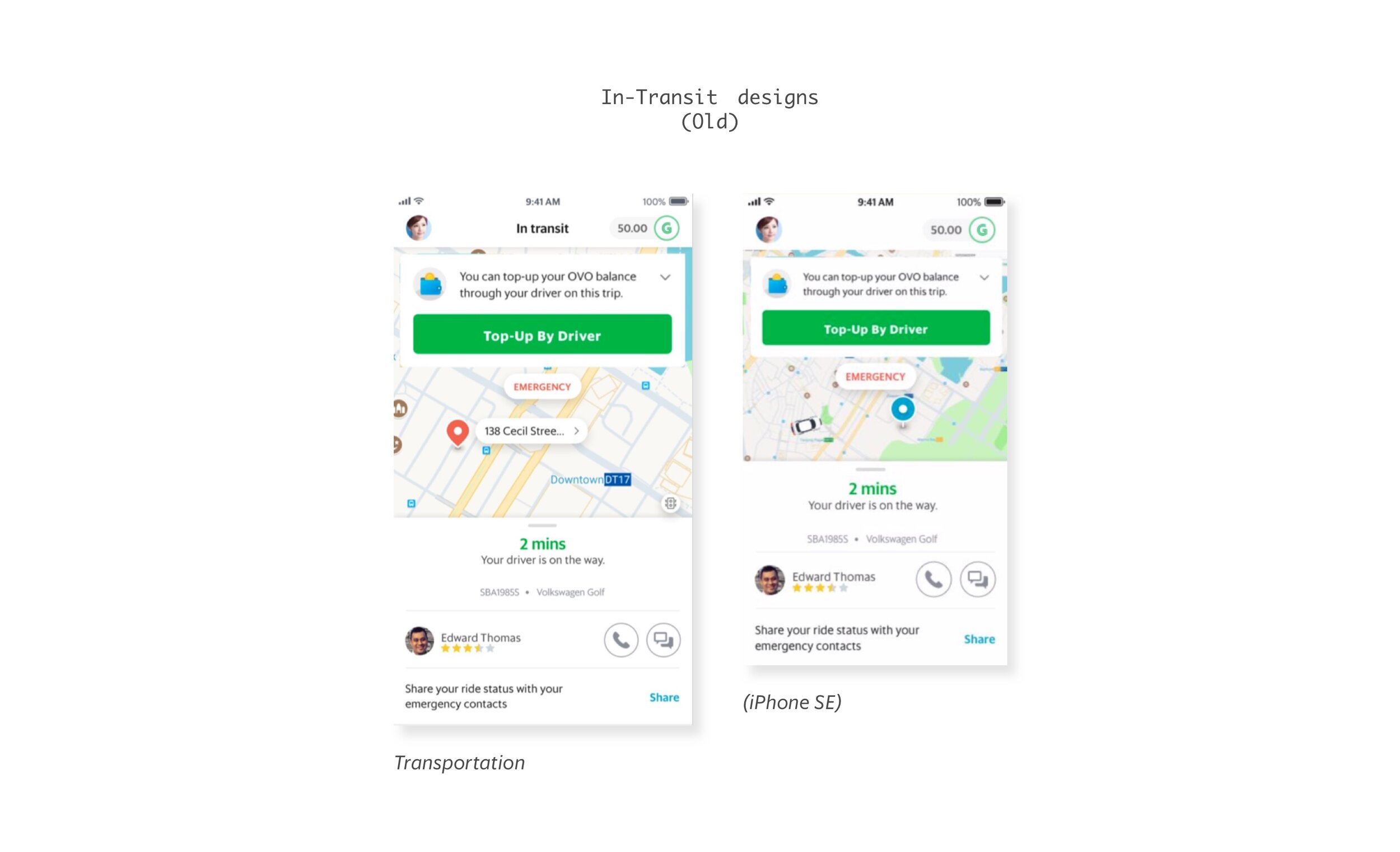
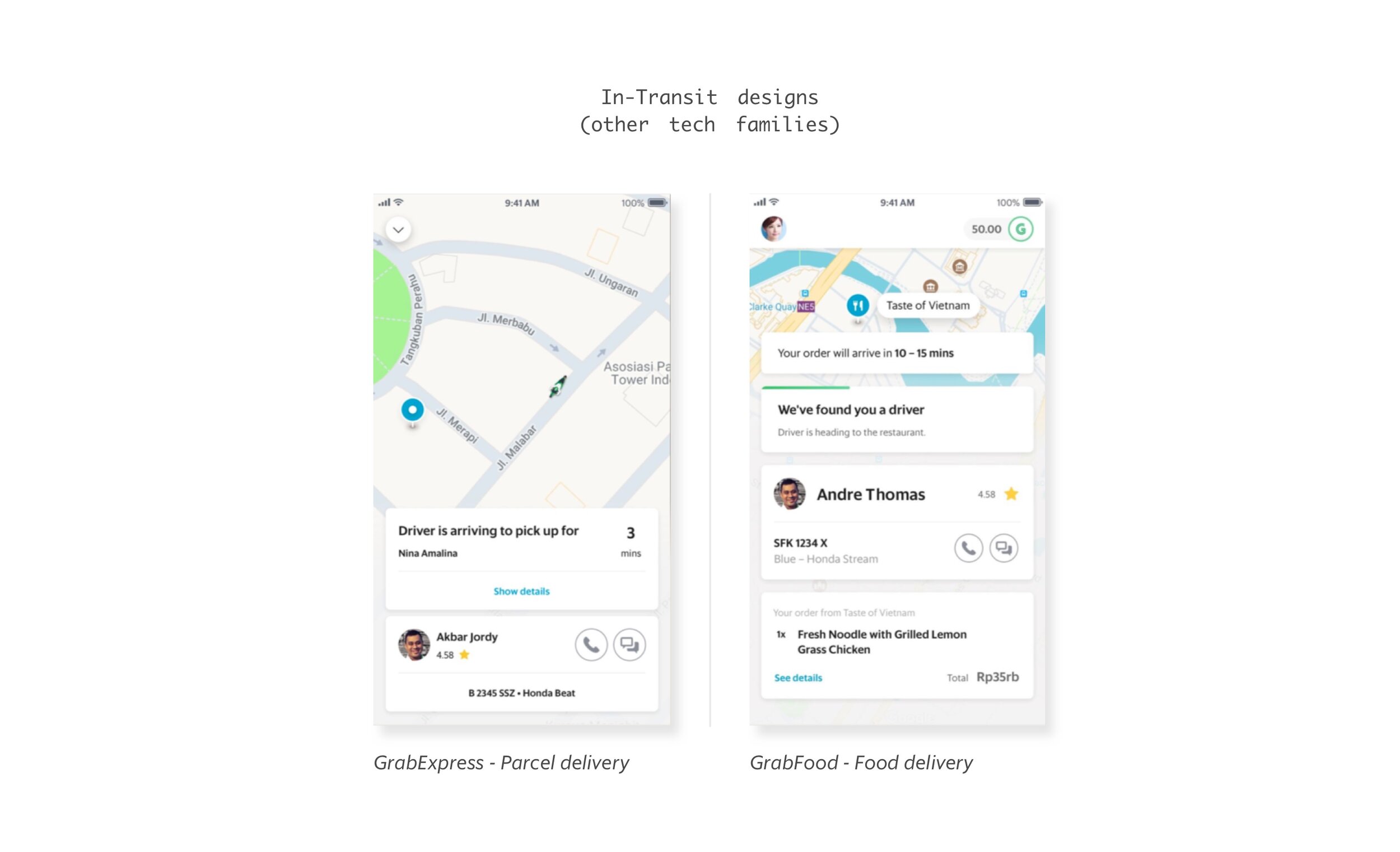
Challenge: Overcoming Growth hurdles
The year 2019 marked a significant turning point for Grab. Fresh off the heels of our merger with Uber, we soon launched the Grab Super App. In contrast to Uber’s strategy of separating major services, Grab integrated all of its offerings into a singular platform - a strategy particularly favored in Asia and South East Asia. However, with our rapid business expansion came inevitable challenges.
As various tech divisions rolled out new features and products, there was an intense competition for screen visibility. This often overshadowed what should be the passenger's primary focus - the map.
While the majority of Grab’s services are rooted in its logistical framework, they each possessed distinct strategies concerning content, UI, and transitions. This divergence cultivated inconsistencies within the super-app, leading to avoidable cognitive strain for our users.
ROle
During 2018 and 2019, I had the privilege of leading the design direction for Grab’s Passenger pre-boarding, in-transit, and post-trip experiences. For this endeavor, my team comprised a Project Manager, an illustration artist, a content strategist, and design leads from Grab Food, Express, MCA, and the Geo Team. In addition to my design lead responsibilities, I also contributed as a UX researcher and prototyper, ensuring a comprehensive involvement in every aspect of the project.
ProcesS
The initiation of the project began with a comprehensive cross-functional design workshop. This event saw participation from key stakeholders within the passenger team and leads from diverse tech families.
Following the workshop, I collaborated intimately with design leads from various tech families. This collaboration ensured our iterations remained consistent and viable across all services. To further refine our approach, we organized a usability study in Singapore, drawing insights from a diverse group of participants.
During our journey to perfect the UI, we encountered several technical challenges. It became apparent that parts of the existing codebase were outdated, making the project scope broader than we initially estimated. To enhance the user experience by reducing loading times and refining UI transitions, our engineering team embarked on an extensive code clean-up. Recognizing the magnitude of our task, we segmented the rollout plan into distinct phases. The inaugural phase, encompassing all transportation services except for GrabNow, was successfully launched in July 2019.
RESULT
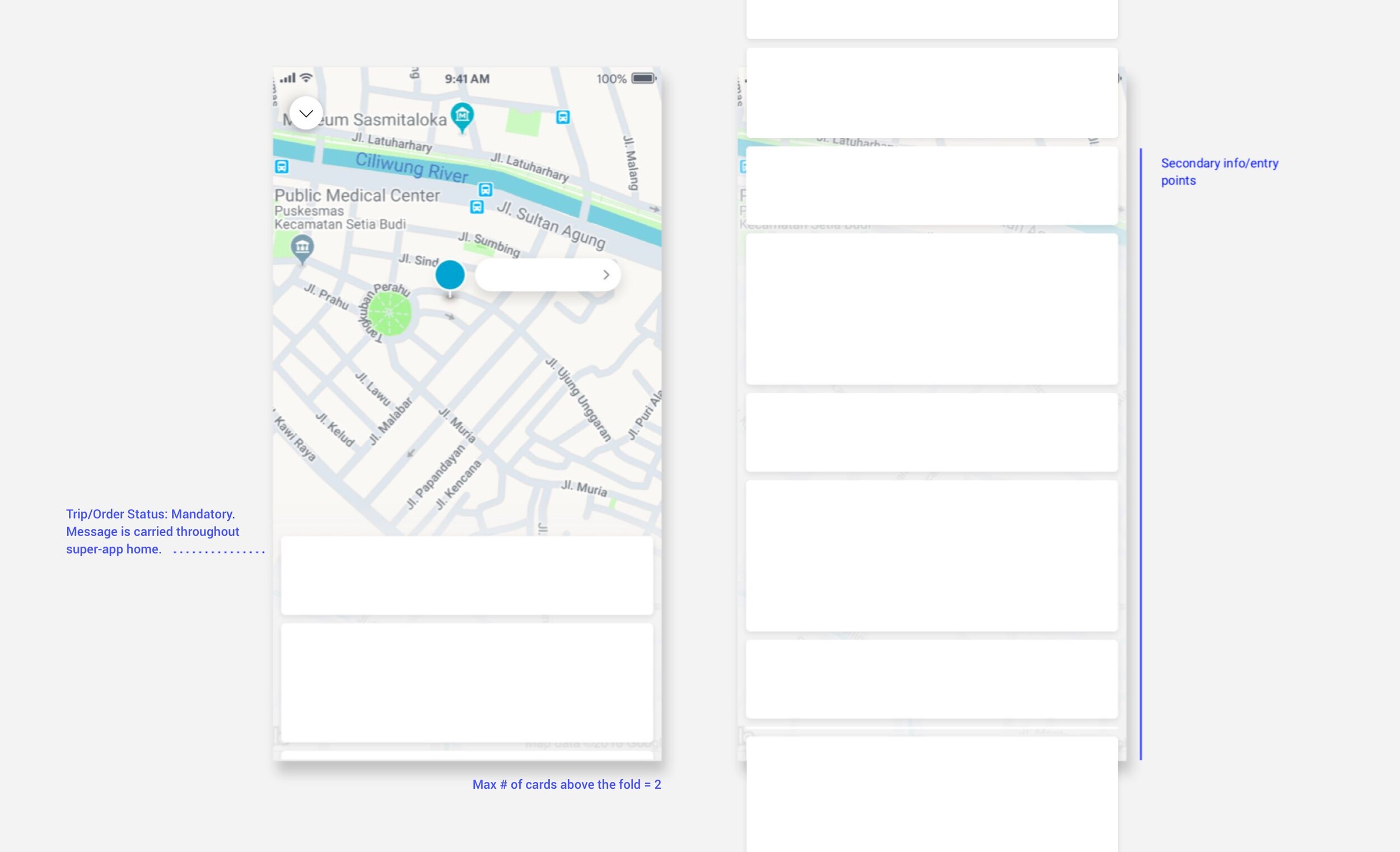
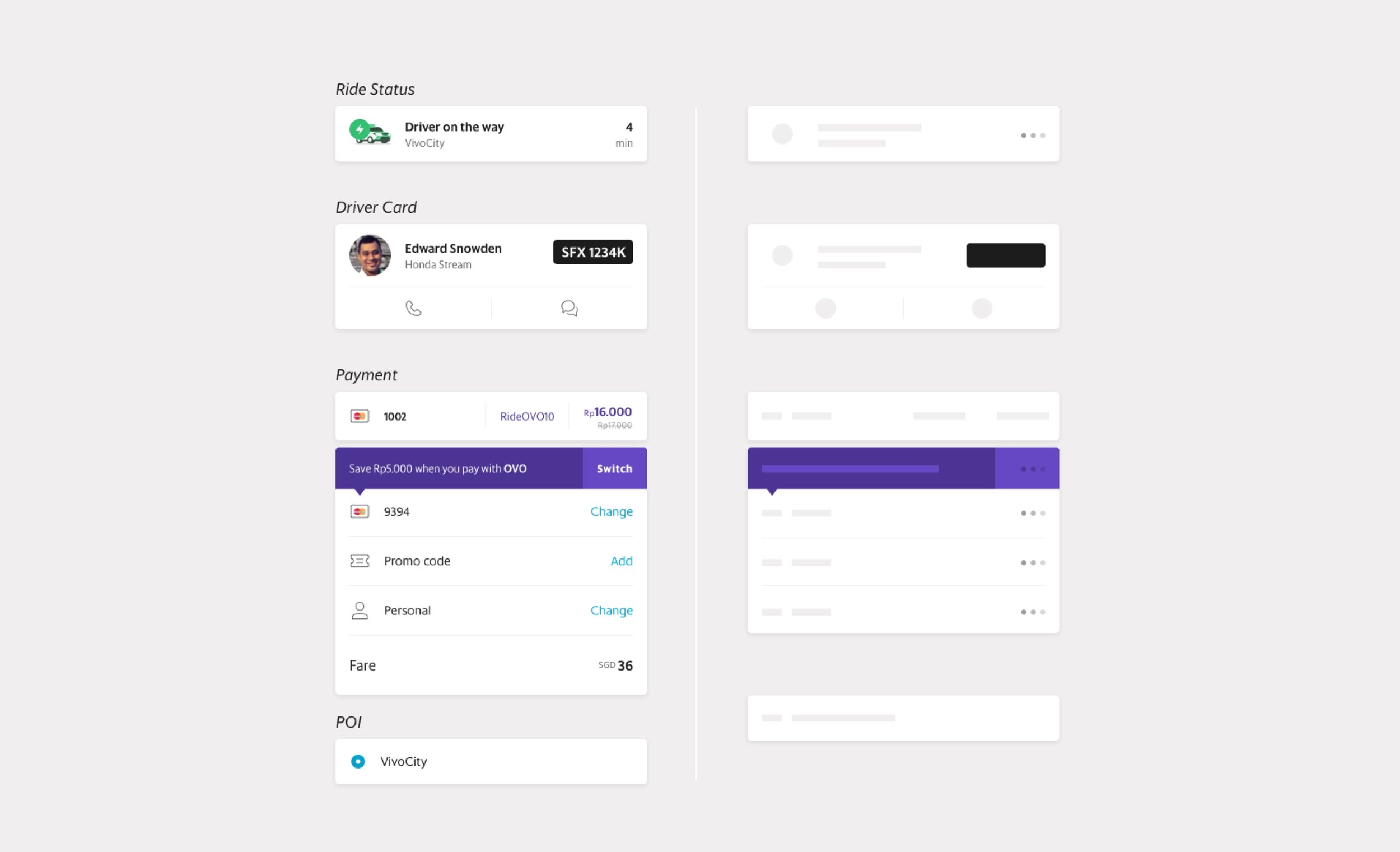
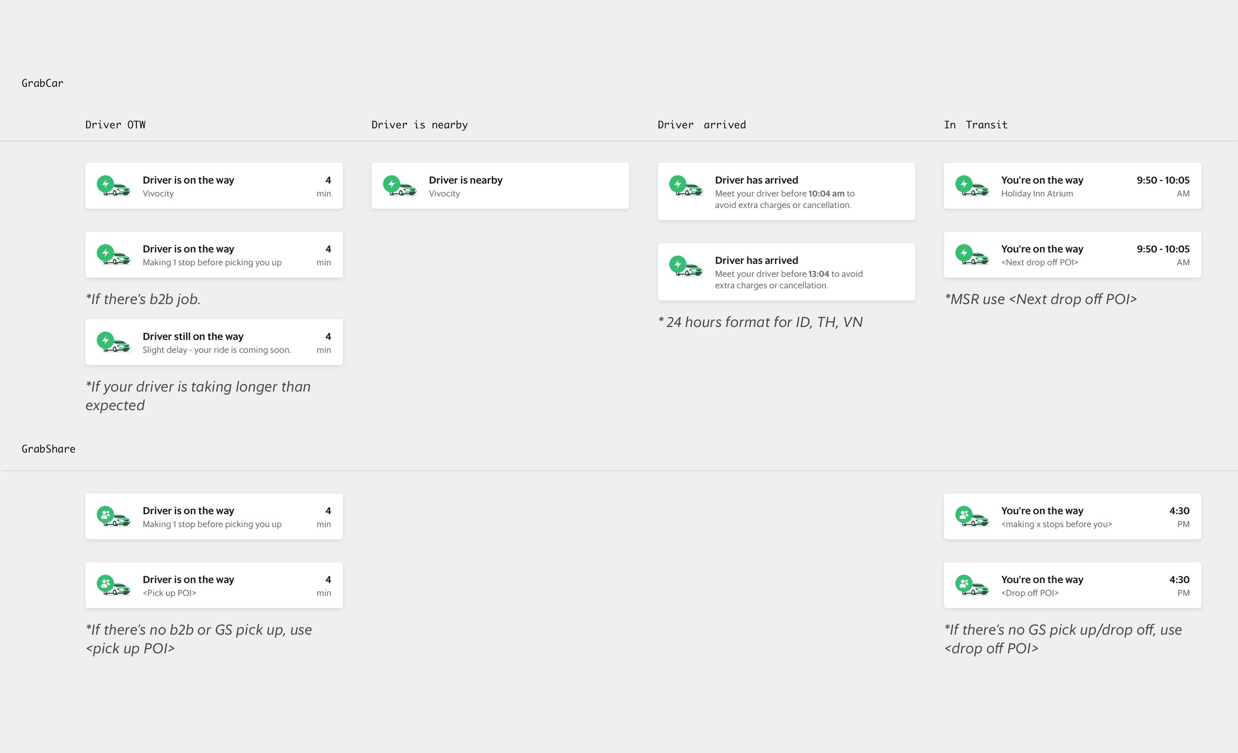
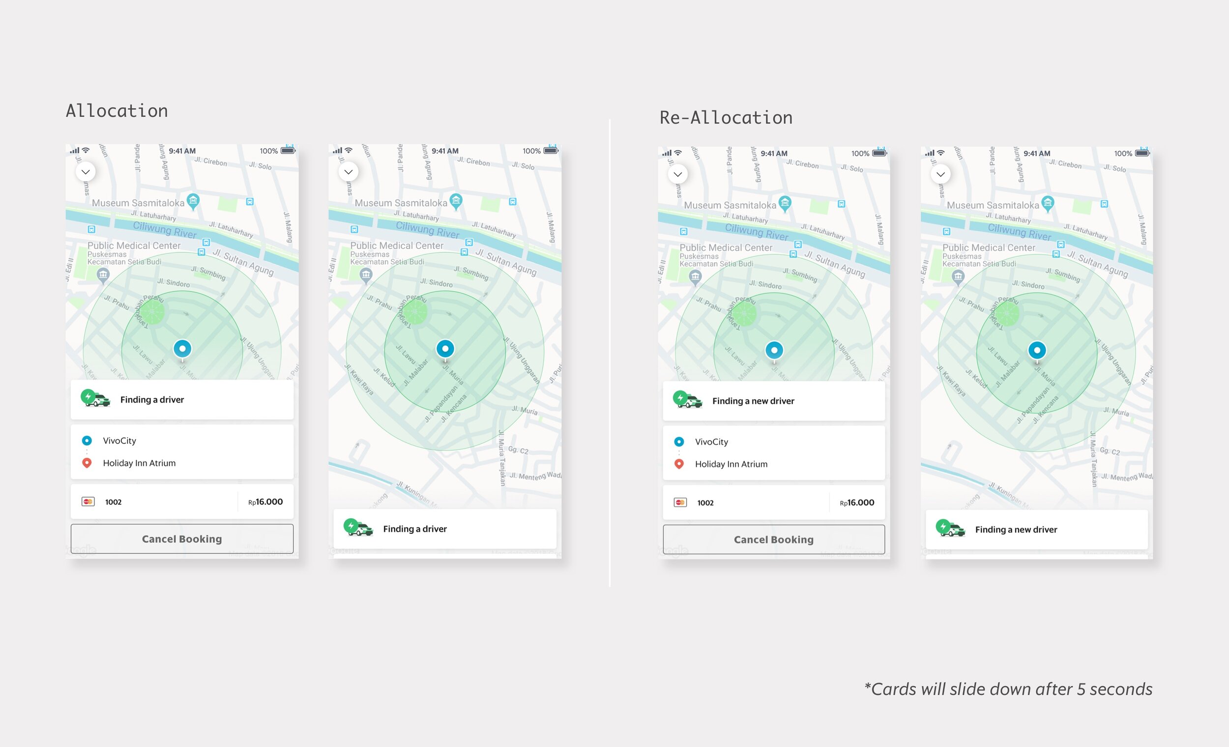
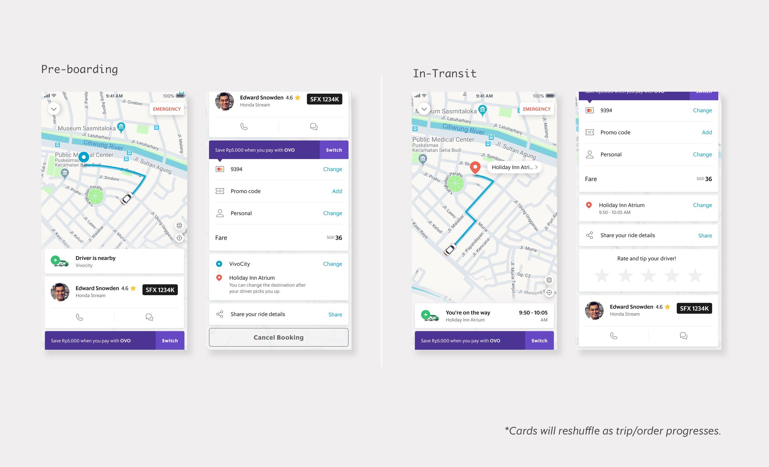
We introduced a scalable, card-based framework. This structure permits different tech families to seamlessly integrate new features into the existing flow without congesting the map view.
For any upcoming feature, entry points can either be crafted on a new card or merged with existing relevant cards. Initially, the placement of these new cards at various stages of the trip or order is manually determined through discussions between the involved tech family and the custodian of that core experience. Over time, these cards are set to benefit from dynamic ranking, leveraging the wealth of historical data at Grab's disposal.
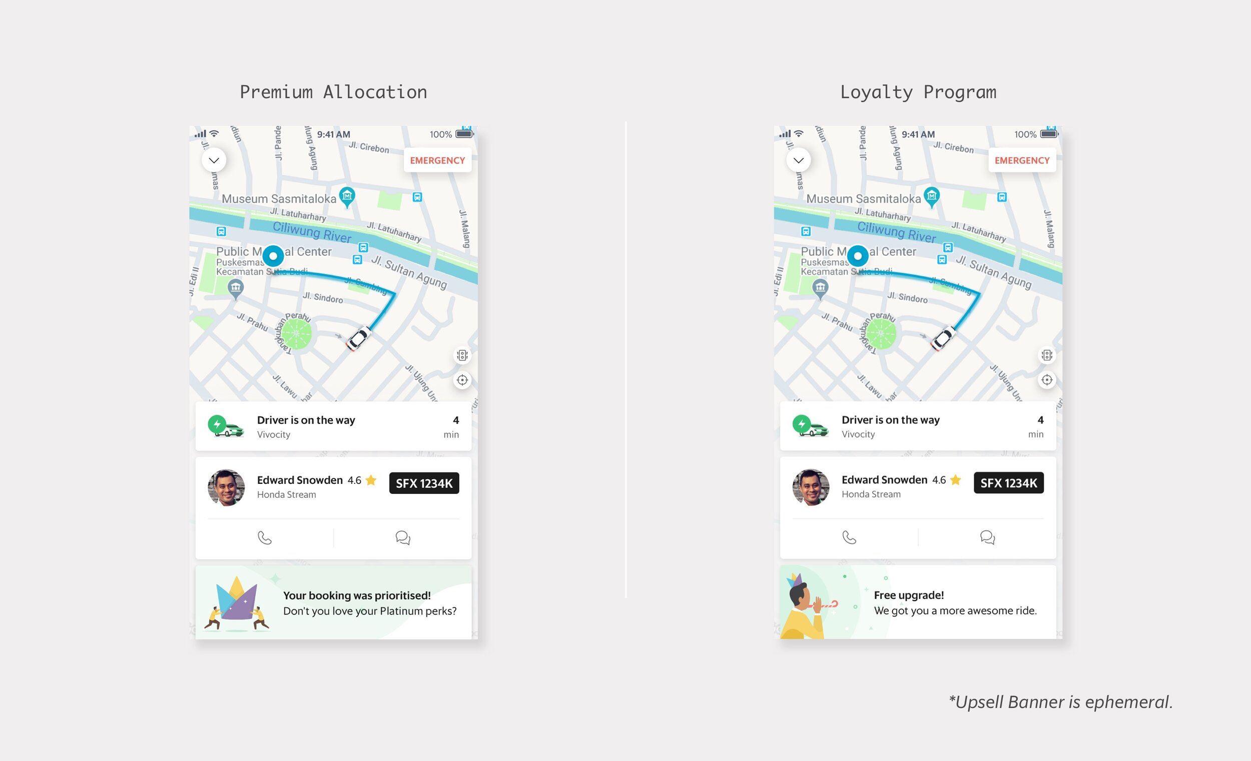
A notable addition is the up-sell banner: a temporary card positioned prominently, designed to spotlight new features. Mirroring the flexibility of the cards, the content of this banner can be timed based on the user's stage in their trip or order.
Finally, we instituted robust design and content guidelines, ensuring sustained consistency within the super-app for the foreseeable future.


